
One of the things I get asked every fall is, “What colors should I be buying this season?” It’s a great question because while there are always plenty of trends, not every color deserves a place in your closet. Some catch your eye on the runway, but don’t always look so great in real life.
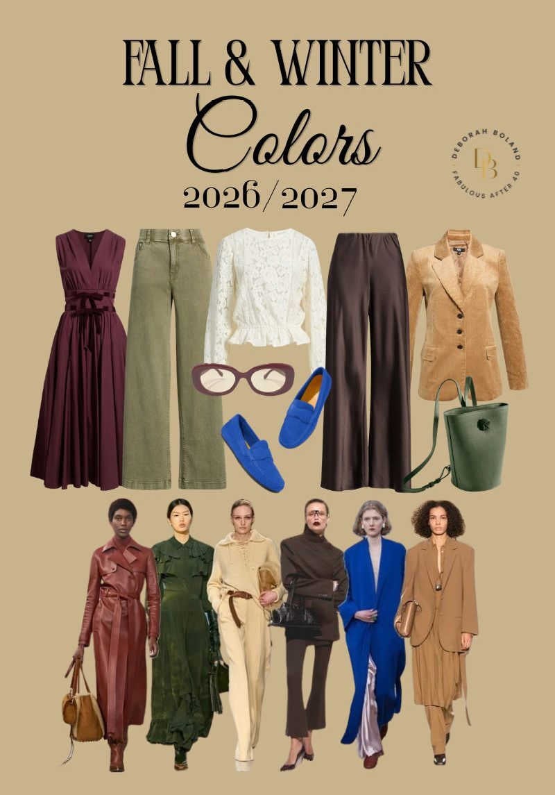
For Fall 2026, designers have moved away from loud, bright colors and are embracing richer, more sophisticated shades that feel timeless, elegant, and easy to wear.
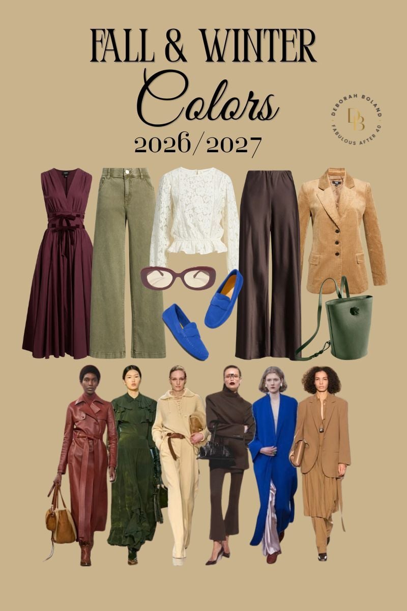
I love this direction and have narrowed down the top new colors I’m most excited about – the ones I’d tell my best friend to buy! Let’s look.
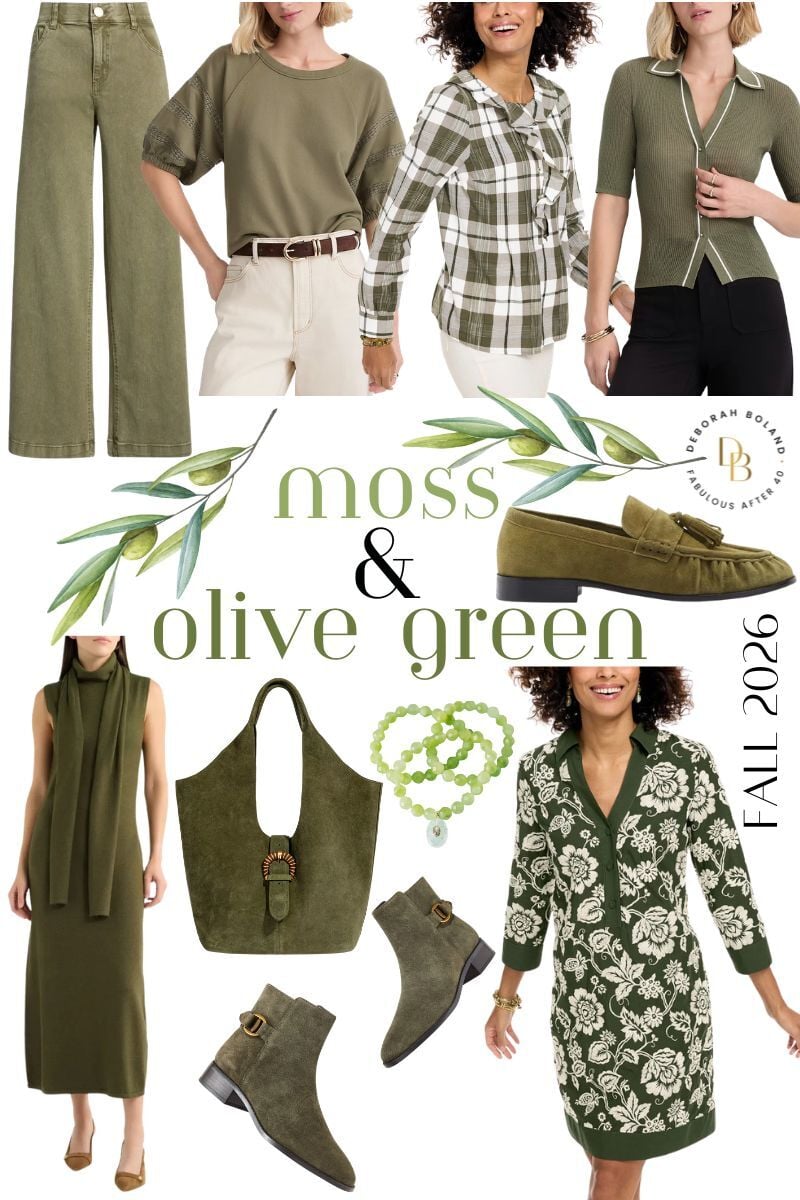
The Colors Everyone Is Talking About: Moss & Olive Green

SHOP GREEN – click photo links above
If you’ve looked at any of the new fall collections, you’ve probably noticed one thing: moss and olive green are everywhere. You’ll see them in utility jackets, sweaters, suede handbags, trousers, loafers, dresses, and boots. These greens are definitely the biggest color story of the season.
But here’s something I want you to know before you rush out and buy an olive sweater or moss pair of pants.
These colors can be absolutely gorgeous on one woman and completely wash another woman out. Why? Because some are warm and golden. Others have cooler gray undertones. Finding the right shade makes all the difference.
And if green isn’t your best color near your face, don’t write it off completely. That’s where a little Tweak Your Chic® thinking comes in. Wear olive as pants, a skirt, a jacket, boots, or try a moss green handbag, but keep one of your best colors near your face.
What does it go with? One reason olive is so popular is that it behaves almost like a neutral. It mixes beautifully with cream, chocolate brown, camel, navy, denim, black, and even leopard print, making it surprisingly easy to work into your wardrobe.
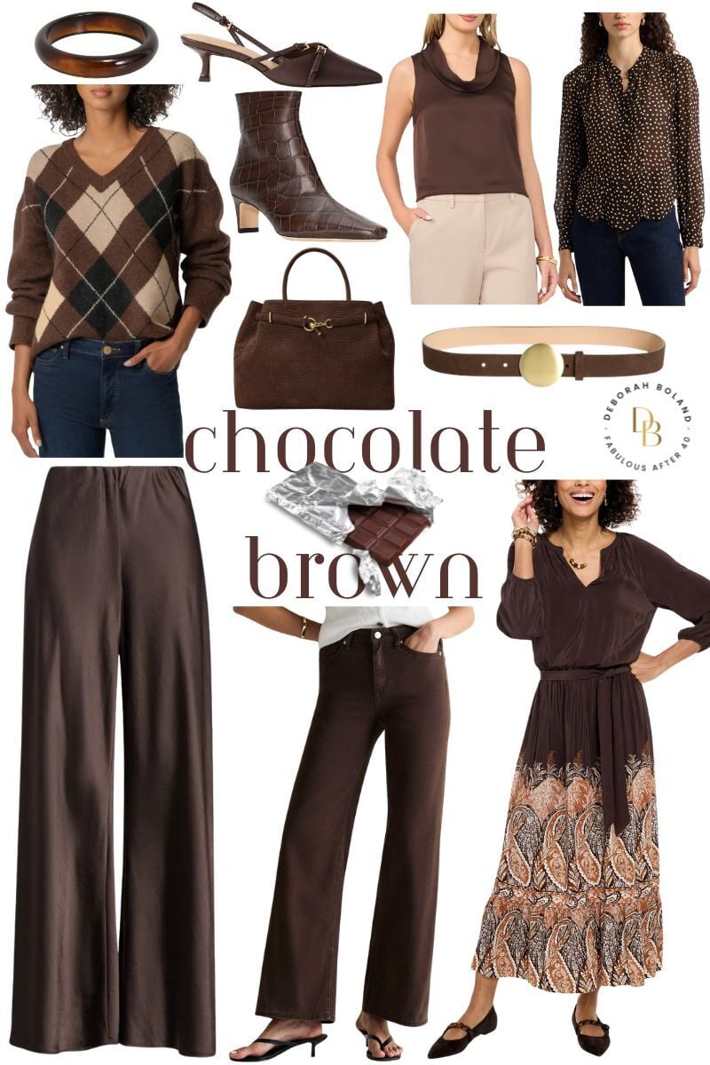
The New Black: Chocolate Brown
SHOP BROWN – Click the photo links above
If there’s one color I think deserves a place in everyone’s fall wardrobe, it’s chocolate brown. I’ve always loved brown, so I’m thrilled to see it having such a big moment this season. While black will always be a classic, chocolate brown feels softer, richer, and often even more elegant.
One of the things I love most about chocolate is its depth. In suede, leather, cashmere, velvet, or a beautiful knit, it has a richness that’s hard to beat. It’s luxurious without being flashy, and it mixes beautifully with almost every other color we’re seeing this fall.
If we were shopping together, this is one of the first colors I’d have you try on. I’d probably hand you a chocolate sweater and a black one and ask you to look at yourself in the mirror. You might be surprised at how much softer and richer chocolate looks, especially if black has started to feel a little harsh against your complexion.
I especially love it with cream, olive, camel, navy, and this season’s gorgeous wine reds. It also looks fantastic with light-wash denim if you want something a little more casual.
If you’ve always reached for black out of habit, I’d encourage you to try chocolate brown this fall. You may discover it gives your wardrobe the same versatility but with a little more warmth and softness.
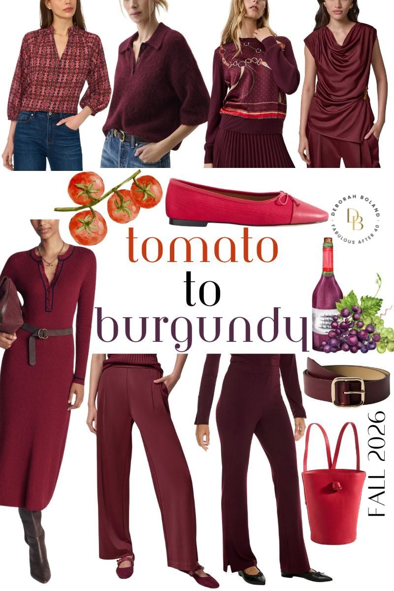
My Favorite Color Family This Season: Rich Deep Reds
SHOP RED – Click photo links above
Rich reds are trending this fall. Think about the beautiful colors of a glass of Pinot Noir, Merlot, or Bordeaux. These shades bring that feeling to your wardrobe. Some lean berry.
Some have a touch of plum. Others are darker and moodier. A few even have a soft, rosy undertone that makes them especially flattering. Whatever retailers call them—burgundy, merlot, Bordeaux, wine, or dark cherry—they all share the same rich, elegant feel. What I love is that they aren’t as bold as bright red. They’re softer, more sophisticated, but they still have life.
Wear them with cream for a gorgeous contrast, chocolate brown for a luxurious tonal look, camel for warmth, navy for a classic pairing, or even olive if you’re feeling adventurous.
A sweater, a handbag, loafers, or a beautiful coat in one of these shades will instantly make your wardrobe feel current.
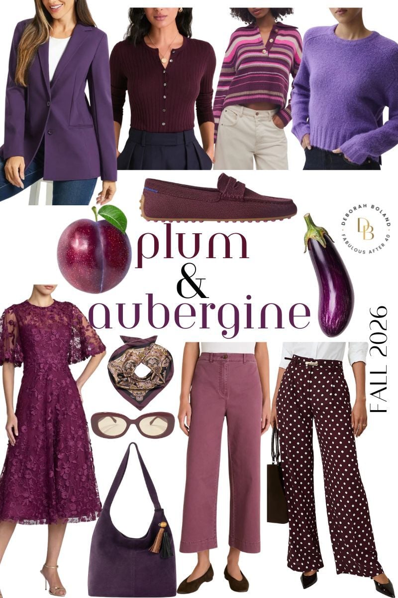
The Hidden Gems: Plum and Aubergine
Click photo links above
If rich wine reds are the stars of the season, plum and aubergine are the quiet supporting cast. These deep purples have such a regal, elegant feel.
Warmer versions have a hint of red or yellow and look beautiful on women with warm coloring. Cooler plums, with more blue or black undertones, are stunning on cool complexions. That’s why it’s worth trying on a few different shades instead of assuming plum isn’t for you.
Whether it’s a satin blouse, a handbag, or a cozy sweater, plum adds richness without feeling loud.
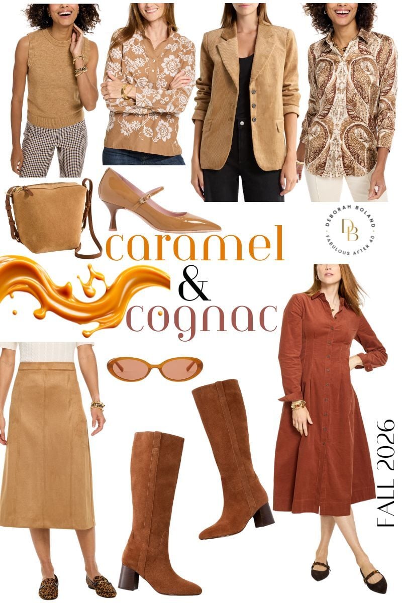
The Timeless Classics: Caramel to Coganc
SHOP CARAMEL – Click photo links above
Camel, in shades from caramel to coganc never seems to go out of style, and there’s a good reason why. It has a timeless elegance that instantly makes an outfit look expensive. A camel coat, beautiful knit, tailored trousers, or handbag can work for years.
If you have warm coloring, classic camel will look wonderful on you. If you’re cooler ( more pinky skin and ashy hair), don’t give up on camel altogether. Look instead for softer versions that lean more taupe, mushroom, or cool beige.
In fact, if I were helping you in the fitting room, I’d have you try on a few different shades before deciding. It’s amazing how one camel can make your skin glow while another leaves you looking washed out and tired. Finding the right version is what makes all the difference.
Camel also mixes beautifully with every color I’m writing about in this post, making it one of the smartest investments you can make.
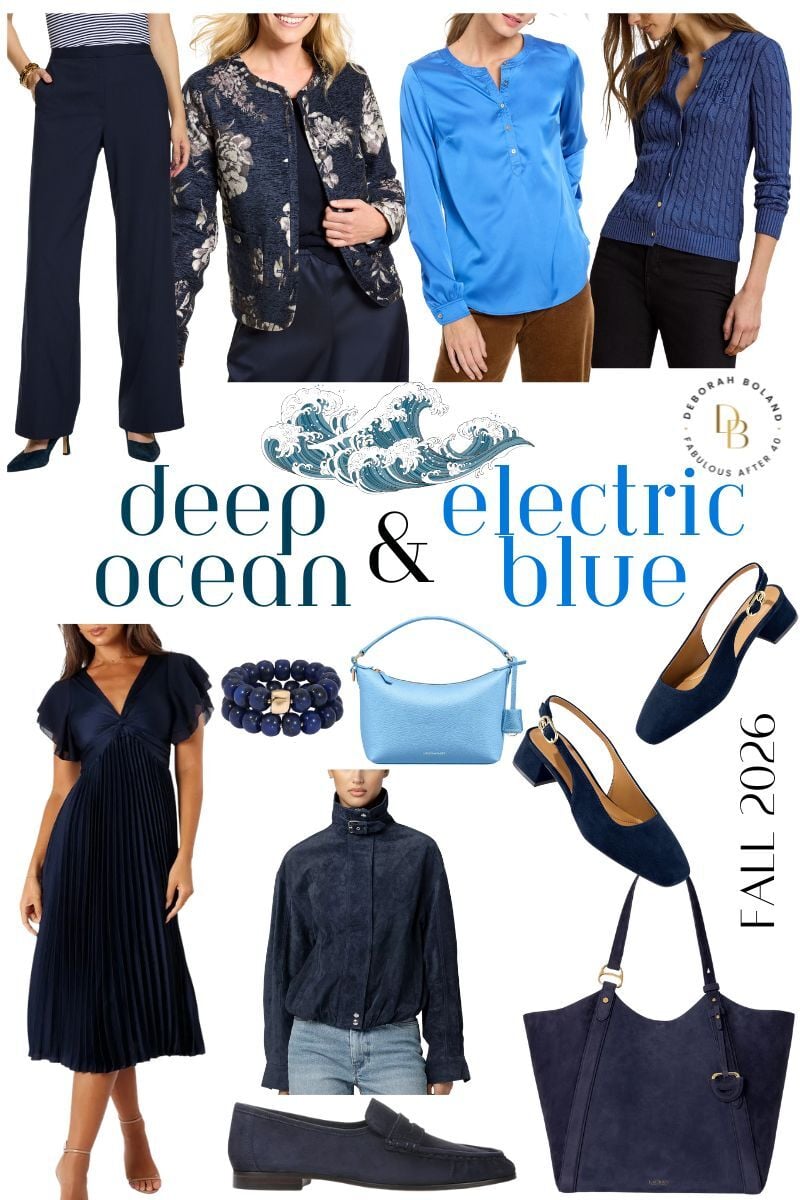
The Investment Neutral I’ll Never Stop Recommending: Navy & Electric Blue
Shop Blue – Click photo links above
If someone asked me to build a wardrobe around one dark neutral, navy would always be near the top of my list.
It’s every bit as elegant as black but usually softer and easier to wear. As we get older, many women find black feels a little harsh against their skin. Navy gives you that same polished look without overwhelming your coloring.
It’s also very versatile. Pair it with cream, camel, rich wine reds, olive, or chocolate brown, and you’ll have outfits you’ll wear for years. A navy blazer, coat, knit dress, or trousers will never feel dated.
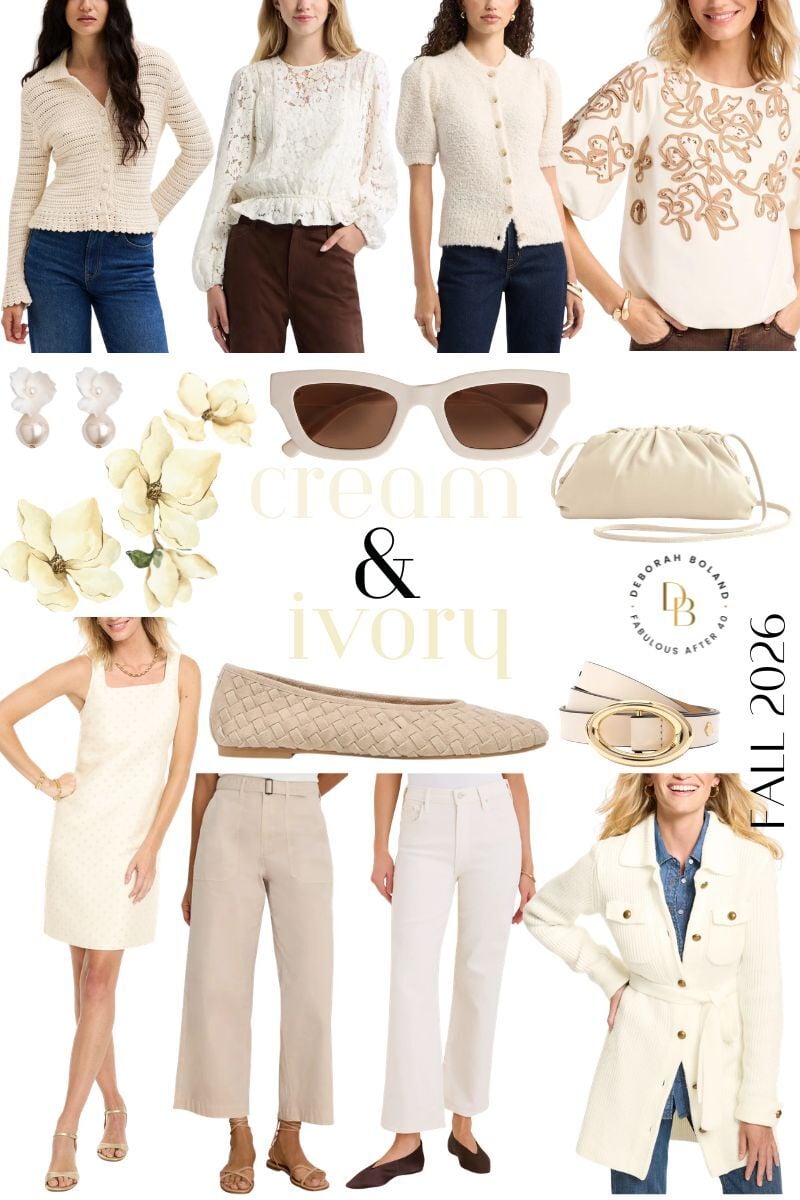
The Color I’ve Grown to Love for Fall: Cream & Ivory
Shop Cream – Click photo links above
I’ll admit it—I used to think of cream as more of a spring color. But over the last few years, I’ve completely changed my mind.
Now I look forward to wearing cream every fall. Something about a chunky cream sweater, winter white jeans, a beautiful wool coat, or a cozy knit dress instantly makes an outfit feel lighter, brighter, and more sophisticated.
I also love the contrast it creates with all of this season’s deeper colors. Pair cream with olive, chocolate brown, camel, navy, or one of this fall’s rich wine reds, and suddenly the whole outfit feels fresh and modern.
And yes, I still believe white jeans deserve a place in your fall wardrobe. Swap your sandals for loafers or ankle boots, add a cozy sweater, and they’re just as chic in October as they were in July.
Read next: How to Wear Cream and Winter White
My Favorite Color Combinations This Fall
One reason I’m enjoying this season’s palette so much is that these colors naturally work together. Here are a few combinations I’ll be wearing a lot this fall. They all read as instant sophistication:
- Olive + cream
- Chocolate brown + cream
- Rich wine reds + camel
- Navy + cream
- Olive + chocolate brown
- Camel + navy
- Plum + gray
- Chocolate brown + light-wash denim
When you’re shopping, don’t buy individual pieces. Think about outfits.
One question I always ask myself is, “Can I wear this at least three different ways with what’s already in my closet?” If the answer is yes, it’s probably a smart buy.
Deb’s Take
One of the biggest mistakes I see women make is feeling like they have to wear every color trend that’s in style. Wrong!
The best colors aren’t necessarily the ones fashion editors are talking about. They are the ones that make you look healthy, rested, and confident.
I encourage you to experiment with color until you find what works for you. For example, choose a cooler olive instead of a warm one. Or, wear chocolate brown instead of black. It can also mean carrying this season’s “it” color as a handbag instead of wearing it next to your face. Those little tweaks are what make style personal.
To learn more about your best colors, read my post on color theory. I’m a big believer! Fashion color trends will come and go, but understanding your most flattering colors never goes out of style.



2026, I’ll be wearing everything here – olive/moss, chocolate, tomato red, plum, camel/cognac, deep ocean, and cream – because as an Autumn, those colors are ALWAYS in my closet and I wear them all year round. :) But I don’t follow a trend just because it’s a trend. I get what works best for me. The only thing that the “on trend” colors this year will help me with – filling wardrobe gaps or replacing worn items.
For 2025, lyons blue, hot chocolate and french roast will be my choices. I wear them all year round, to be honest. Easier to find them when they’re trending. I’ll have to see if chili oil is warm enough, usually burgundy based reds are too cool for my complexion. :)
Happy Birthday, Debbie!! My favorite is Rose Violet which I have on my toes at the moment. It is such a gorgeous color. I hope you have a wonderful Happy Birthday & have fun on your get away!
Thanks, Bonnie for the lovely birthday message. I wear a similar color on my toes. It goes with everything! Great year round!
Happy Birthday, Debbie.
All the best for another 62 of “Fabulousness.” Have an excellent R & R.
Thank you for always bringing the latest fashions and trends to your followers. You are always appreciated.
Good article. I’m in autumn in coloring, so stick to my fall colors. I’ve been seeing a lot of rust in the stores lately. It makes a difference in how you look in the right colors. I used to wonder why I seemed so drab in cool colors like blue. I like cool colors on other people.
I’m not keen on some of them. The pink I would love it if not dusty. Blue & green are good. Samba red is ok. That’s it for my winter/summer coloring, light skin & calm blue eyes. If you know of any petite sites that have beautiful or current trending clothes, would you please share them? I would love to find some. My small selection is getting smaller, and I have to be careful at some of them not to get too young a look, as in Loft, BR, etc.
Thanks for the update! Autumn with green eyes, this is MY season, and I love these colors. I have been surprised to see burnished reds And ‘rust’ colors included in spring fashions, but now I know a couple of spring-like colors in the fall lineup.
I guess the blurring of the lines only makes our clothes more wearable. Accessories rule and sure help us celebrate our beautiful seasons.
Everyone makes choices that keep us all safe, even though dressing up is on the back burner.
Hi Debbie, Colors are becoming seasonless, aren’t they? These shades are bright for fall, but it keeps things interesting. I bought a bright orange top thinking it was end-of-season merchandise, only to realize it had just arrived for fall. Same as that lemonade color. It feels like spring and summer, not Autumn. Take care! Deb
Great! We can keep wearing our Spring clothes with sleeves then. :)
I love this summary!
I love the article, and the suggested outfits coordinate beautifully, but am I the only one who thinks these colors are dull, greyed mid-tones? ere’s no “pop.” The red is not red but has more brown in it – and not a pretty chestnut. Where are all the lovely, clear jewel tones for fall? Potter’s Clay leather boots or pants, perhaps…
I love this post. The colors for this fall are gorgeous! I love the items of clothing you’ve shown for each color. These, too, are very beautiful. I love fall clothing, and I am excited to re-organize my wardrobe and do a little shopping. I love your website, and this post was one of my favorites.
Thank you.
Aimee
Red has always been my favorite color. I wear it regardless if it’s in season or not, with a dash of red lipstick!
Red equates to a Positive attitude! We need Red during these times.
Red is one of my best and favorite colors. So excited to see that it is taking center stage right now! An excellent excuse to buy more red :)
Hi Deborah!
As usual, you never disappoint your readers. The color ideas and the fashions and accessories are indeed fresh and stylish. I can’t wait to add some of these great items to my existing wardrobe.
Deborah, your site is Fabulous. I love it!
Best regards to everyone,
Christie
So Glad you enjoyed this color report, Christie. Watch for the top 10 Fall Trends coming up this week. Cheers! Deborah
Can you purchase books in the stiff back instead of e-books? If so, how much are they?
Hi Louise, Sorry, the books are eBooks and not hardback. They are ebooks that you can read on your computer or iPad.
I like green.
Hi Judy, I find the navy is such a refreshing change from black. It’s a little softer against aging skin and, combined with the green, is vibrant. I’ll post some more outfits in this color combo. Cheers! Deborah
I am excited to add more of the blues to my wardrobe and the reds as well. I look best in jewel tones. I like green, but emerald looks better on me. Even though I have a tan from being outside a lot, my skin has cool undertones, and the more dusty colors make me look drab.
Me also. Dusty colors drab me out. I am calm, and the burnished dusty shades don’t work, although they are beautiful! With this pandemic, my wardrobe is headed downhill as I have to shop online and need more shops for Petites.
So glad to see several cool colors included. Warm tones and I just don’t mix well :)
Hi Cheryl,
Sounds like you have had your colors done. It’s really important to know about color and all the ways it affects your style. The right colors can make you look Fab or drab. that is why I wrote Color Me Fabulous. It’s a fantastic ebook that I highly recommend if you want to look Age-Amazing. If anyone would like to check it out, it is here.
Deborah, what a delicious description of all of Pantone’s Fall colors and spectacular ways to use them. I have also been playing with their colors in my jewelry designs and am especially excited to start working with them! I think the combinations could be stunning and energizing.
I like this autumn’s palette. I can hardly wait to see your ideas for incorporating it into ‘real people” wardorbes. You always do such a good job at bringing trends into reality for the over-40 group.