Top 10 Fall/Winter Fashion Colors 2025/26 to Instantly Update Your Style
Fall is in full swing with winter on it’s way and we are seeing more and more of the gorgeous fall colors in stores from thePantone 2025 Fall Fashion color trends report. A while back I filled you in on what made the top ten! Here’s an update of what’s new in stores in these colors!
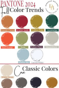
Pantone Fall 2025 Colors Palette
One of my favorite fashion seasons is Autumn. I love all those dense, earthy tones that evoke images of gray skies, falling leaves, and long scenic drives through the October countryside. Every year, the traditional Fall palette shifts slightly, becoming a little more muted, bold, or even adding an unexpected color.
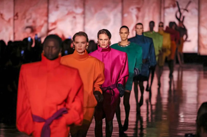
Pantone describes the colors for Autumn/Winter 2025/26 as “imbued with a feeling of effortless glamour, Colors for NYFW Autumn / Winter 2025 / 2026 are approachable and accessible.”
In other words, these colors are the best of both worlds. They’re luxurious and classy, yet real—wearable, welcoming, and glamorous!
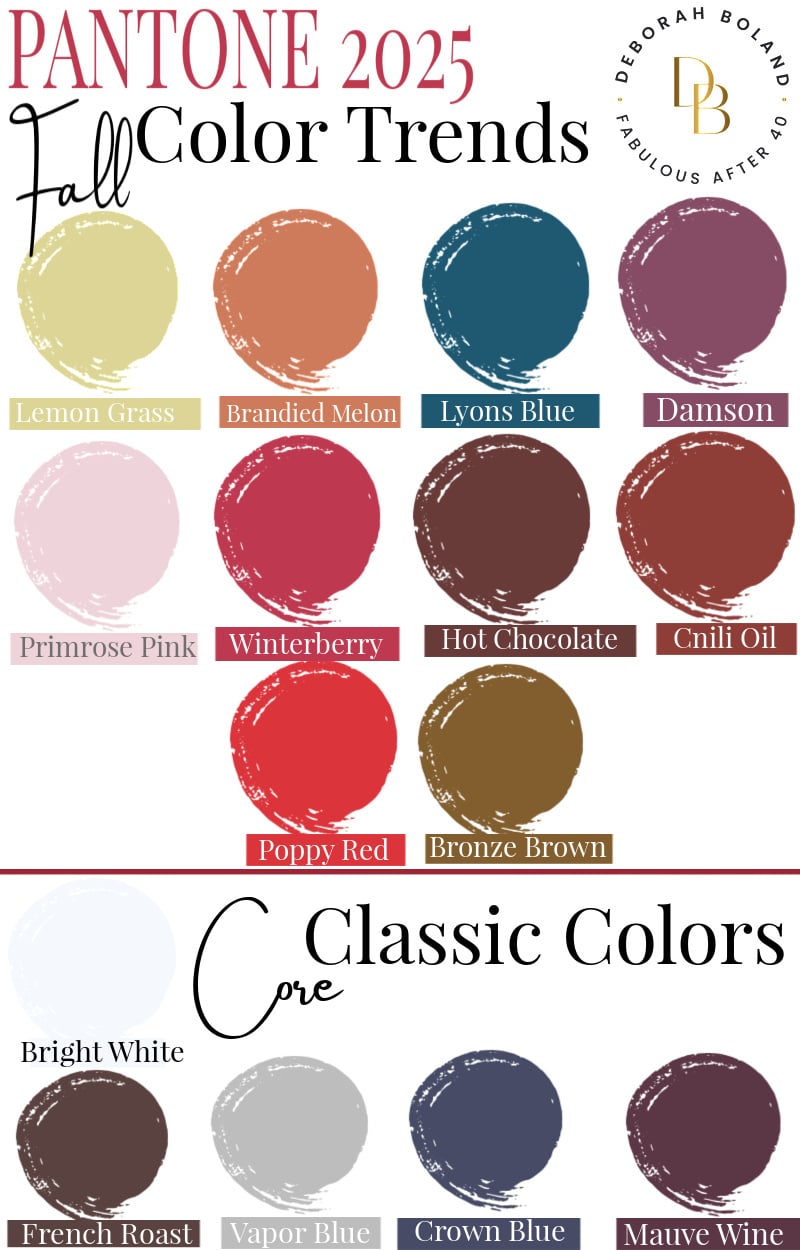
Top 10 Fall Fashion Colors 2025

1. Lemon Grass
I’m diving in with a new Fall color that you’ll either love or hate. Lemon Grass is a lemon-infused green that feels a bit out of place for Fall. It’s light and sweet, not traditionally earthy, but that’s also what makes it exciting and fashion-forward. I’m the first to admit that this color is challenging to wear, especially as a solid. (Dare I say it, but it reminds me of throat phlegm!) However, I notice that as part of a print, where small touches are used, it can add a lovely freshness. This is a wait-and-see for me.
2. Brandied Melon
Orange is common in the Fall, but can sometimes be so bright you stick out like a jack-o-lantern. Brandied melon resembles a dusty orange, but it’s really a soft, earthy brown with a warm pink undertone. I like it because it’s colorful but cozy. If you’re a warm-toned gal like me, it’s going to look amazing next to your peachy skin!
3. Lyons Blue
Ooh, yes, I love this! I’ve mentioned that many times: as we age, black, our once-favorite color, can suck the life out of our complexions, making us look tired and dull. What I like about Lyons Blue, an intense blue-green, is that it’s powerful like black but gives you life! Let’s call it a deeply tinted teal, with a luxurious vintage vibe. This would be great for work or a special occasion when you want to look a little more formal and powerful, but not intimidating.
4. Damson
Purple is at its peak this Fall, with the main shade being Damson. Like Lyons blue, it is rich and intense with a vintage vibe. It’s also on the warm side, which I love because those black purples can sometimes feel too dark and draining for me. This is more on the plum side. I will be wearing this a lot!
5. Primrose Pink
The weather may get colder and harsher as we move into Fall and then winter, but you can stay soft and sweet in this pretty pink. Primrose pink is a gentle and illuminating shade. It would be gorgeous as a cozy, light cashmere sweater with jeans or mixed with some of these other muted Fall shades. I’ll be trying this one.

6. Winterberry
Stunning! That’s how I’d describe this gorgeous, dark red with berry undertones, which is bright but not loud like a stop sign. I want to buy everything I see in this color and can’t wait to pair it with denim or black pants, and also wear it as part of a print. This shade of red would look equally as fab if you had cool or warm-toned skin and hair. And imagine this color against a snowy backdrop in winter – it’s truly vibrant
7. Hot Chocolate
Cozy and comforting, Hot Chocolate looks just as you’d expect – decadent and delicious! Brown is replacing black this Fall, and I’m thrilled about it. Hot chocolate is on the warmer side, but if you prefer a darker brown, stay tuned for French Roast, coming up in a minute!
8. Chili Oil
A vital and robust red, Chili Oil is an exciting mix of burgundy and brown, making it warmer than straight burgundy. It’s rich and sophisticated, and I think it’s going to be a big hit this Fall!
9. Poppy Red
We talked about Winterberry, which is huge for Fall, but another red is stealing the spotlight, too. Poppy red is a bright, exuberant color that turns heads. The main difference between the two reds is that Poppy red is more of a cross between red and orange, so it’s warmer. If you want a sensual look this Fall, poppy red is your color. I think it will be fantastic as a cocktail dress for glamorous Fall events. I’ll wear this color casually to bring fun and excitement to my weekend outfit. Red sneakers are hot!
10. Bronze Brown
Is it gold, is it brown? It’s a bit of a bot, and often it looks like it has a little olive green woven in too. I like this color, but I find it heavy and masculine, so I prefer it layered with a brighter gold or as part of a print if I wear it near my face. A pair of bronze brown pants, though, would be fantastic, and I have spotted lots of those, including in velvet. Can’t wait to try.
A recap of the Top 3 Fashion Colors!
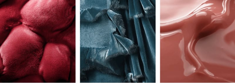
Mix the Fall 2025 Fashion Colors with these New Luxurious Neutral Colors!
You can change the feel of any of the colors I’ve discussed by pairing them with this season’s classic, luxurious neutrals. These seasonless shades are from left to right…
Shop the neutrals!
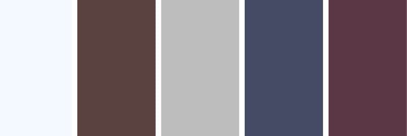
Bright White: An optical white with a brightened presence, Bright White clarifies and cleanses.
French Roast: French Roast is an intense, full-bodied brown shade with an earthy and tasty undertone.
Vapour Blue: A hazy blue hue, Vapor Blue adds an unobtrusive and cooling touch.
Crown Blue: Crown Blue is a dependable, constant, and ever-faithful classic blue expressive of longevity in design.
Mauve Wine: Imbued with natural grace and beauty.
How to Wear the New Fall 2025 Colors
Adding at least one or two of these new Fall colors into your wardrobe will instantly make you look modern, but choose the ones that work with your seasonal palette. There’s no sense in wearing the latest colors if they look horrible on you.
To wear a seasonal color that is not in your palette, wear it as an accent. It can be the color of your shoe, purse, or jewelry.
An example is Lemon Grass (green-yellow). You could wear a floral dress that incorporates some of this trendy color in the print, or add a lemon grass accessory, such as a scarf, bag, or shoe.
What do you think of the new Fall colors? Which will you wear and how? I’d love to know.










For 2025, lyons blue, hot chocolate and french roast will be my choices. I wear them all year round, to be honest. Easier to find them when they’re trending. I’ll have to see if chili oil is warm enough, usually burgundy based reds are too cool for my complexion. :)
Happy Birthday, Debbie!! My favorite is Rose Violet which I have on my toes at the moment. It is such a gorgeous color. I hope you have a wonderful Happy Birthday & have fun on your get away!
Thanks, Bonnie for the lovely birthday message. I wear a similar color on my toes. It goes with everything! Great year round!
Happy Birthday, Debbie.
All the best for another 62 of “Fabulousness.” Have an excellent R & R.
Thank you for always bringing the latest fashions and trends to your followers. You are always appreciated.
Good article. I’m in autumn in coloring, so stick to my fall colors. I’ve been seeing a lot of rust in the stores lately. It makes a difference in how you look in the right colors. I used to wonder why I seemed so drab in cool colors like blue. I like cool colors on other people.
I’m not keen on some of them. The pink I would love it if not dusty. Blue & green are good. Samba red is ok. That’s it for my winter/summer coloring, light skin & calm blue eyes. If you know of any petite sites that have beautiful or current trending clothes, would you please share them? I would love to find some. My small selection is getting smaller, and I have to be careful at some of them not to get too young a look, as in Loft, BR, etc.
Thanks for the update! Autumn with green eyes, this is MY season, and I love these colors. I have been surprised to see burnished reds And ‘rust’ colors included in spring fashions, but now I know a couple of spring-like colors in the fall lineup.
I guess the blurring of the lines only makes our clothes more wearable. Accessories rule and sure help us celebrate our beautiful seasons.
Everyone makes choices that keep us all safe, even though dressing up is on the back burner.
Hi Debbie, Colors are becoming seasonless, aren’t they? These shades are bright for fall, but it keeps things interesting. I bought a bright orange top thinking it was end-of-season merchandise, only to realize it had just arrived for fall. Same as that lemonade color. It feels like spring and summer, not Autumn. Take care! Deb
Great! We can keep wearing our Spring clothes with sleeves then. :)
I love this summary!
I love the article, and the suggested outfits coordinate beautifully, but am I the only one who thinks these colors are dull, greyed mid-tones? ere’s no “pop.” The red is not red but has more brown in it – and not a pretty chestnut. Where are all the lovely, clear jewel tones for fall? Potter’s Clay leather boots or pants, perhaps…
I love this post. The colors for this fall are gorgeous! I love the items of clothing you’ve shown for each color. These, too, are very beautiful. I love fall clothing, and I am excited to re-organize my wardrobe and do a little shopping. I love your website, and this post was one of my favorites.
Thank you.
Aimee
Red has always been my favorite color. I wear it regardless if it’s in season or not, with a dash of red lipstick!
Red equates to a Positive attitude! We need Red during these times.
Red is one of my best and favorite colors. So excited to see that it is taking center stage right now! An excellent excuse to buy more red :)
Hi Deborah!
As usual, you never disappoint your readers. The color ideas and the fashions and accessories are indeed fresh and stylish. I can’t wait to add some of these great items to my existing wardrobe.
Deborah, your site is Fabulous. I love it!
Best regards to everyone,
Christie
So Glad you enjoyed this color report, Christie. Watch for the top 10 Fall Trends coming up this week. Cheers! Deborah
Can you purchase books in the stiff back instead of e-books? If so, how much are they?
Hi Louise, Sorry, the books are eBooks and not hardback. They are ebooks that you can read on your computer or iPad.
I like green.
Hi Judy, I find the navy is such a refreshing change from black. It’s a little softer against aging skin and, combined with the green, is vibrant. I’ll post some more outfits in this color combo. Cheers! Deborah
I am excited to add more of the blues to my wardrobe and the reds as well. I look best in jewel tones. I like green, but emerald looks better on me. Even though I have a tan from being outside a lot, my skin has cool undertones, and the more dusty colors make me look drab.
Me also. Dusty colors drab me out. I am calm, and the burnished dusty shades don’t work, although they are beautiful! With this pandemic, my wardrobe is headed downhill as I have to shop online and need more shops for Petites.
So glad to see several cool colors included. Warm tones and I just don’t mix well :)
Hi Cheryl,
Sounds like you have had your colors done. It’s really important to know about color and all the ways it affects your style. The right colors can make you look Fab or drab. that is why I wrote Color Me Fabulous. It’s a fantastic ebook that I highly recommend if you want to look Age-Amazing. If anyone would like to check it out, it is here.
Deborah, what a delicious description of all of Pantone’s Fall colors and spectacular ways to use them. I have also been playing with their colors in my jewelry designs and am especially excited to start working with them! I think the combinations could be stunning and energizing.
I like this autumn’s palette. I can hardly wait to see your ideas for incorporating it into ‘real people” wardorbes. You always do such a good job at bringing trends into reality for the over-40 group.